| Author |
Message |
|
{uZa}Innocent
|
 |
Post subject: New Compass Thoughts...  Posted: Posted: Mon Jul 07, 2014 8:26 pm |
|
 |
| Mucho Posto! |
 |
Joined: Sun Feb 22, 2009 6:20 pm
Posts: 540
Location: New Orleans, Louisiana, USA
|
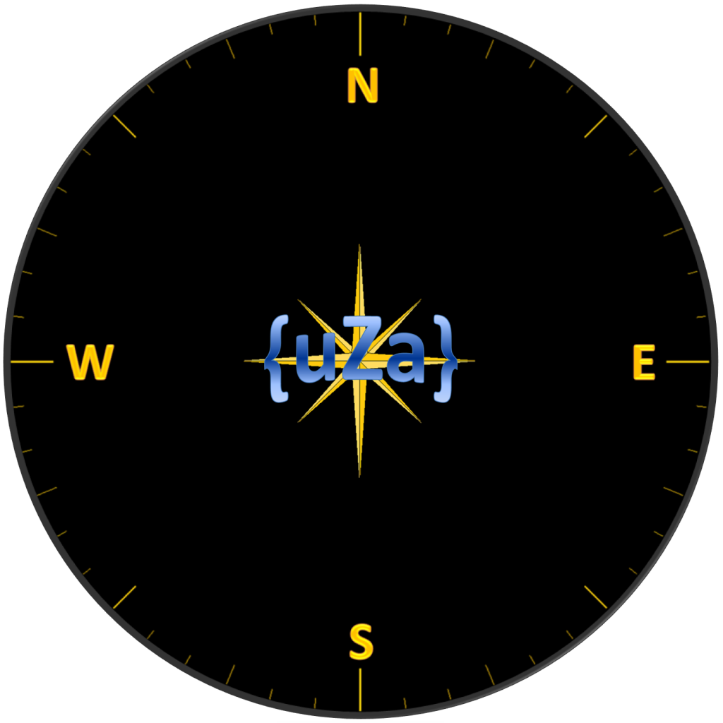
Dupont wanted me to post this and get your feedbacks on the Compass. Which do you like better? With or Without Markings? Attachment: Attachment:
|
|
  |
|
 |
|
{uZa}mattbaker
|
Post subject: Re: New Compass Thoughts...  Posted: Posted: Mon Jul 07, 2014 10:01 pm |
|
 |
| Mucho Posto! |
 |
Joined: Thu Feb 19, 2009 10:24 pm
Posts: 835
Location: Sarasota, FL
|
|
With markings.
_________________  
|
|
  |
|
 |
|
{uZa} I_DI_EZ
|
Post subject: Re: New Compass Thoughts...  Posted: Posted: Tue Jul 08, 2014 1:52 am |
|
 |
| Mucho Posto! |
 |
Joined: Sat Jun 12, 2010 10:54 pm
Posts: 527
|
|
bottom picture is awesome, I like the markings
_________________ 
|
|
  |
|
 |
|
{uZa}Studdog
|
Post subject: Re: New Compass Thoughts...  Posted: Posted: Tue Jul 08, 2014 5:55 pm |
|
Joined: Thu Feb 19, 2009 11:12 pm
Posts: 897
Location: Indiana, USA
|
|
I like a plain compass so that it is easier to see the perps, but in this case, the compass with markings looks better.
|
|
  |
|
 |
|
{uZa} I_DI_EZ
|
Post subject: Re: New Compass Thoughts...  Posted: Posted: Tue Jul 08, 2014 10:31 pm |
|
 |
| Mucho Posto! |
 |
Joined: Sat Jun 12, 2010 10:54 pm
Posts: 527
|
hm good point I think we need to run a spread of both of them  we can decide collectively  :D _________________ 
|
|
  |
|
 |
|
{uZa}Studdog
|
Post subject: Re: New Compass Thoughts...  Posted: Posted: Wed Jul 09, 2014 11:04 pm |
|
Joined: Thu Feb 19, 2009 11:12 pm
Posts: 897
Location: Indiana, USA
|
I don’t know if you would like input on creating a new compass or just choosing between the two given. If only between the two given, the one with degree markings looks really cool. If you are interested in ideas for creating a new design, here are a few ideas I had: The purpose of the compass is to see enemies, so most emphases should be on that and less on a cluttered design. Use black bezel as seen in these two examples so that compass is not distracting. Same thing goes for the compass background; use black or dark blue as seen in the two given examples. Then have the N-S-E-W markings as far out from the center as possible and with colors that are not too bright (gold in second sample looks good). Then move the degree markings also to the furthest from center. This opens up more area on compass to see Perps. With the degree markings, drop the numbers as no one really uses them. The {uZa} and graphics in the center of the second compass give the compass a good feeling of being a compass and are not too distracting, so they are great as is. With most of the compass opened up, it will be easier to see Perps. I don’t have the software to create a good compass, but I made a crude sample using MS Paint to show what I am thinking: 
|
|
  |
|
 |
|
{uZa}Innocent
|
Post subject: Re: New Compass Thoughts...  Posted: Posted: Thu Jul 10, 2014 11:20 am |
|
 |
| Mucho Posto! |
 |
Joined: Sun Feb 22, 2009 6:20 pm
Posts: 540
Location: New Orleans, Louisiana, USA
|
|
I like Dupont's second one... If the compass had the map displayed in it as well like the modern warfare and such, and you could see exactly where, around what corner the perp that just fired was, then yeah the extra lines would get in the way, however in COD2, it's just red dots on the compass of the direction and distance the firing came from, so the lines won't really mess up the red dots...
|
|
  |
|
 |
|
{uZa}Renegade
|
Post subject: Re: New Compass Thoughts...  Posted: Posted: Thu Jul 10, 2014 12:03 pm |
|
 |
| Loves to Spam |
 |
Joined: Mon Feb 16, 2009 1:27 am
Posts: 1676
|
Dupont's 2nd. But playing with no compass is more fun  _________________ 
|
|
  |
|
 |
|


